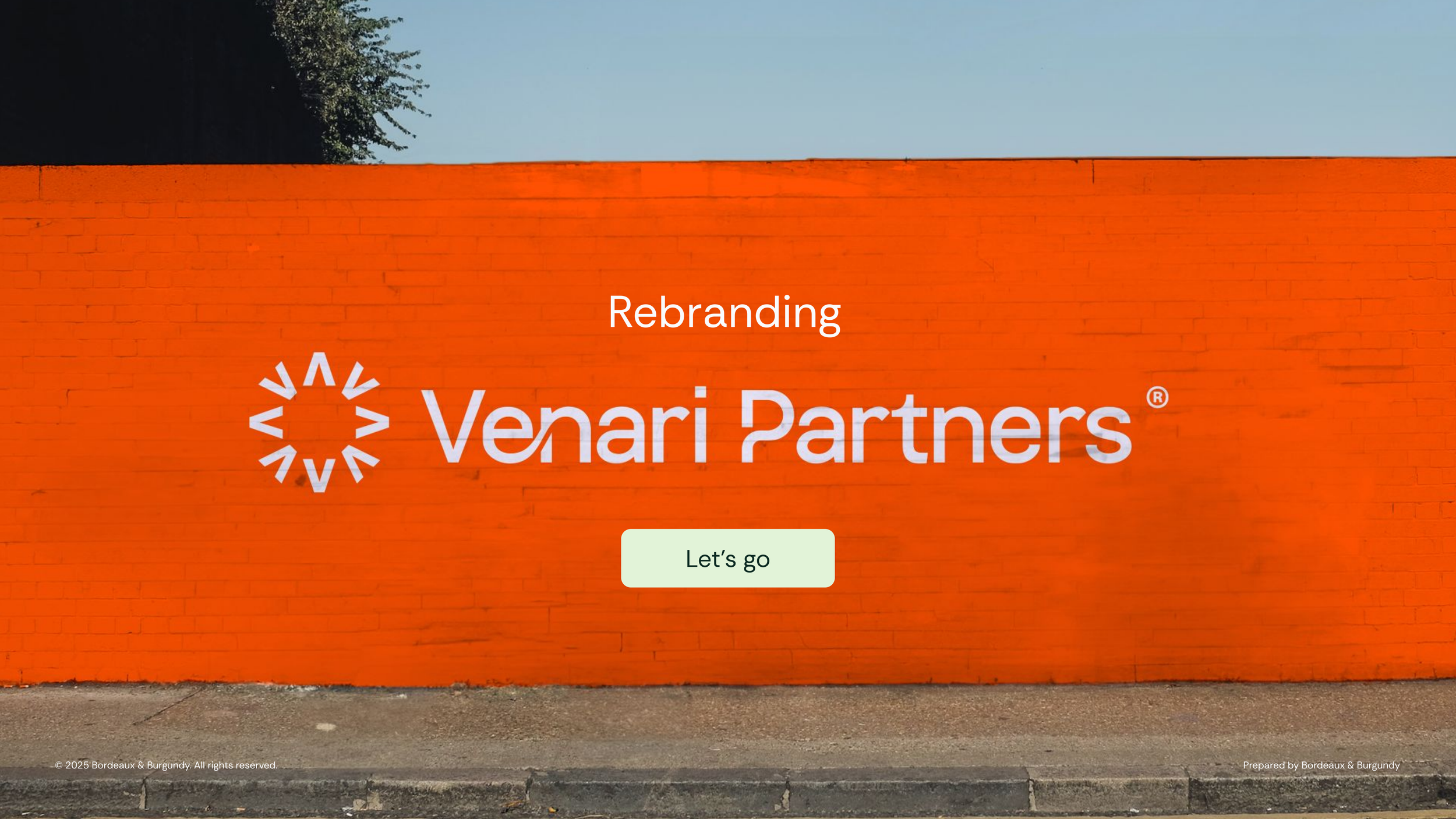
Venari Partners
Rebrand for Executive Recruitment Firm
Venari Partners is an executive search firm specialising in senior leadership recruitment. As the business evolved, the brand needed to better reflect Venari’s role as a trusted guide—confidently navigating clients through complex leadership landscapes—while retaining the equity and recognition built in its existing identity.
The rebrand focuses on clarity, direction, and progress, creating a visual system that feels professional, people-focused, and future-ready.


THE CHALLENGE
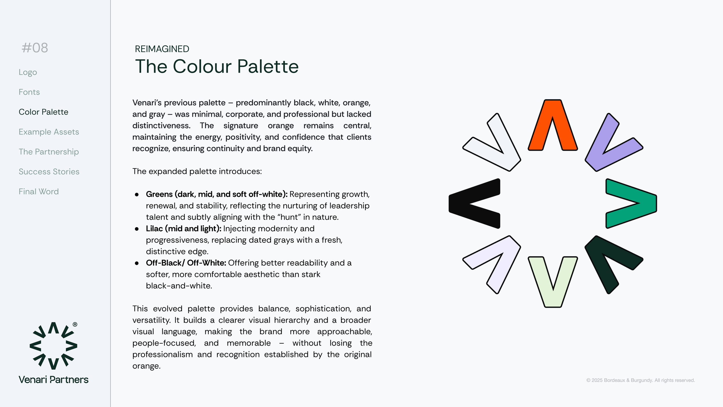
Venari’s previous identity was minimal and corporate, built primarily around black, white, grey, and orange. While professional, it lacked distinctiveness and emotional depth, limiting its ability to communicate Venari’s nuanced, relationship-driven approach to executive search.
The challenge was to evolve the brand without losing familiarity—strengthening recognition, improving versatility, and introducing a clearer sense of purpose and direction.


THE CONCEPT
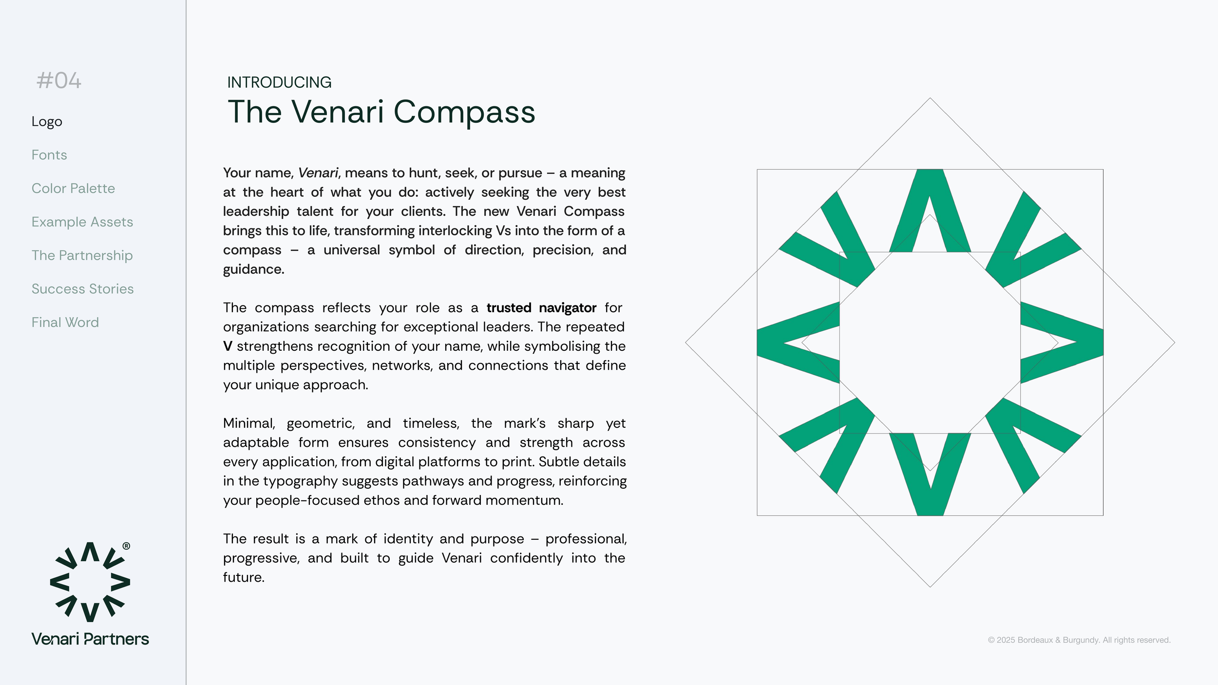
At the heart of the rebrand is meaning. The name Venari translates as to hunt, seek, or pursue—a definition that closely aligns with the firm’s mission of actively seeking exceptional leadership talent.
This idea of pursuit and guidance became the foundation for the visual identity, positioning Venari as a strategic navigator for organisations in search of the right leaders.


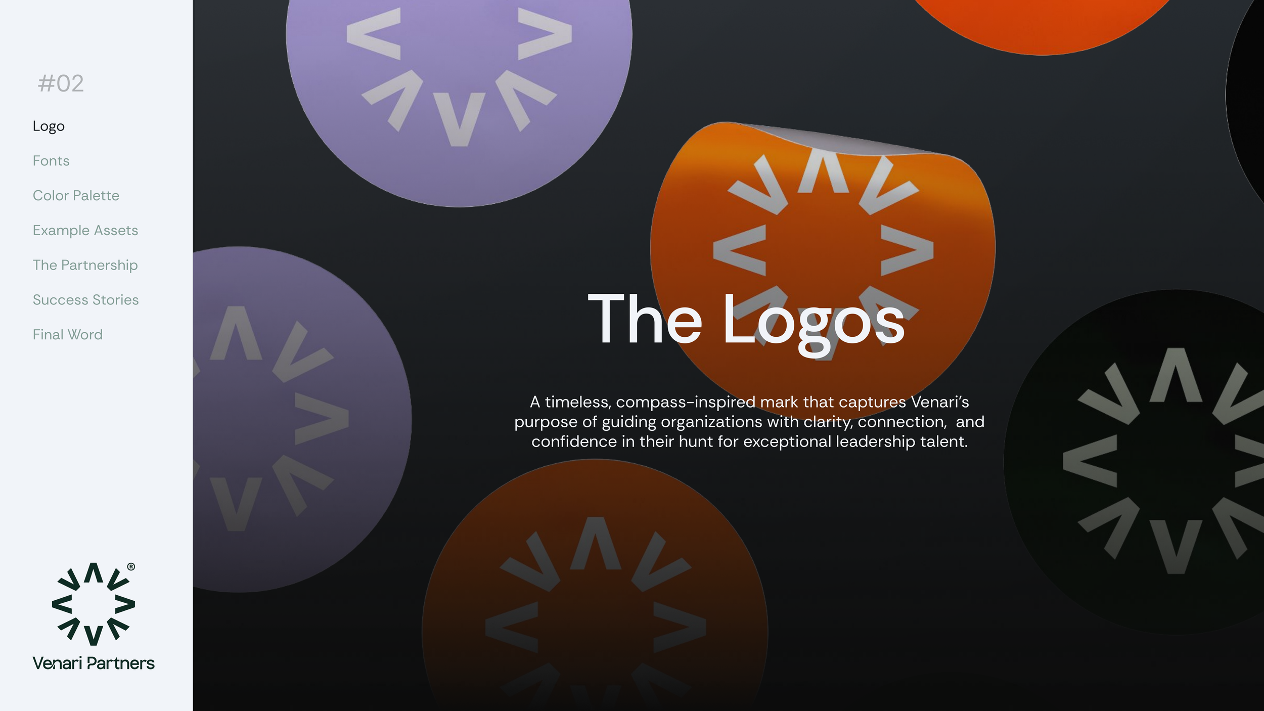
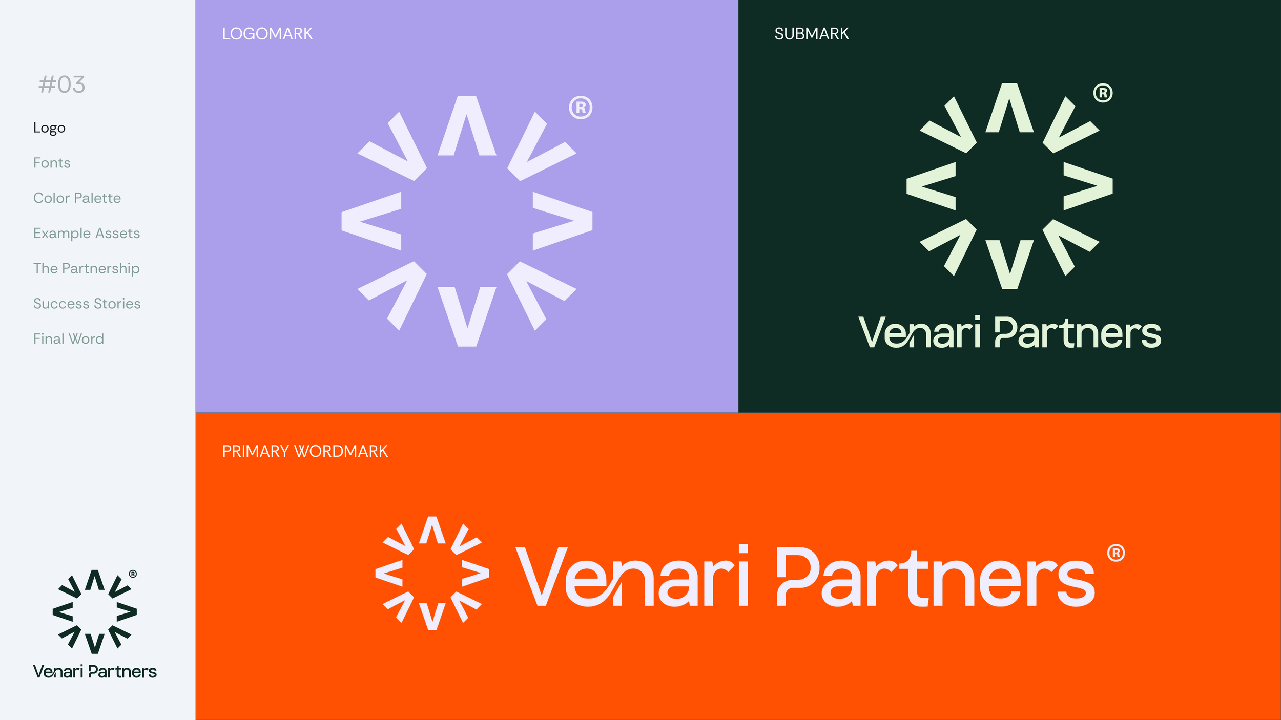
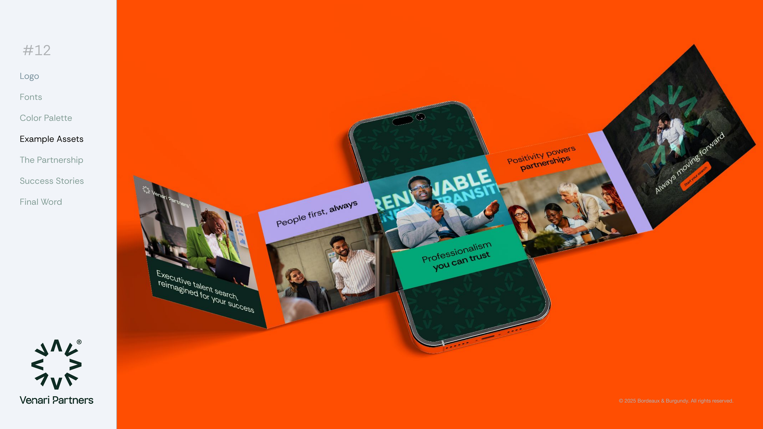
New Logo Suite
The Venari Compass is formed from interlocking V shapes, transforming the brand’s initial into a universal symbol of direction, precision, and guidance.
The repeated V strengthens name recognition while symbolising multiple perspectives, networks, and connections—core to Venari’s executive search approach. Minimal, geometric, and timeless, the mark is designed to be sharp yet adaptable, ensuring consistency across digital and print applications.
Subtle detailing within the mark reinforces movement and progress, resulting in an identity that feels purposeful, professional, and confidently forward-looking.
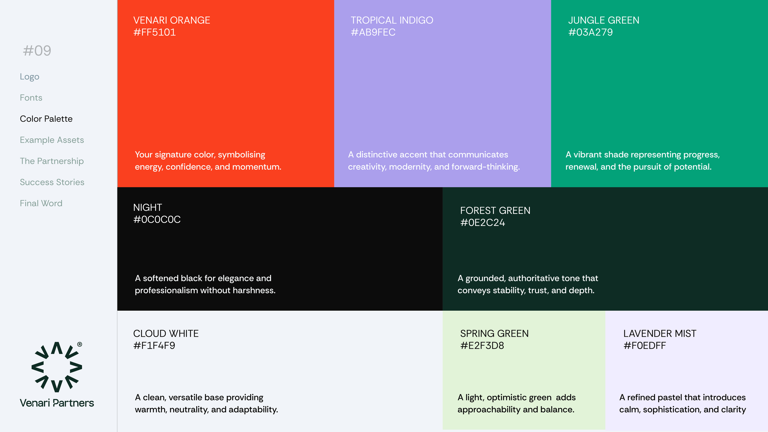
New Colour Palette
The evolved colour palette builds on Venari’s established visual equity while introducing greater depth and distinctiveness.
Signature Orange: Retained as the core brand colour, preserving energy, confidence, and recognition.
Greens (dark, mid, soft off-white): Represent growth, stability, and renewal, subtly referencing the idea of the hunt in nature and the nurturing of leadership talent.
Lilacs (mid and light): Introduce a progressive, contemporary edge, replacing dated greys with a fresher, more distinctive tone.
Off-Black & Off-White: Improve readability and create a softer, more refined aesthetic than stark black and white.
New Typeface
Rethink Sans was selected as Venari’s primary typeface for its balance of precision and warmth.
Clarity & legibility: Open forms and balanced proportions ensure clear communication across all touchpoints.
Modern professionalism: A neo-grotesque foundation paired with humanist qualities reflects Venari’s people-focused ethos.
Versatility: A wide range of weights allows the typeface to flex seamlessly from headlines to long-form content.
Distinctive yet timeless: Contemporary and fresh without feeling trend-led or overly corporate.