SPARETECH
Brand Evolution, Content Design & Campaign
Sparetech is an industrial SaaS company transforming how manufacturing organisations manage spare parts and MRO. They supplied an in-depth white paper containing complex operational and technical insights. The objective was to transform this long-form content into a GTM-ready, executive-focused asset, one that could not only communicate value clearly, but actively support conversion across sales and marketing channels.
Beyond reformatting, the project focused on design-led clarity, elevating both the document and the brand through improved structure, visual logic, and a refined visual system.


THE CHALLENGE
While the original white paper contained strong thinking, its structure and visual presentation limited its impact. Dense layouts, inconsistent hierarchy, and underdeveloped data visualisation made it difficult for senior stakeholders to quickly extract value.
The challenge was to:
Re-architect the document for clarity and flow
Elevate the visual language without a full rebrand
Design supporting assets that extended the paper’s lifespan across campaigns and channels
THE APPROACH
Design was treated as a strategic tool—not decoration.
Starting with the white paper as the core asset, the focus was on clarity, persuasion, and reuse. Every design decision was made to support comprehension, authority, and momentum, ensuring the content worked as hard commercially as it did intellectually.

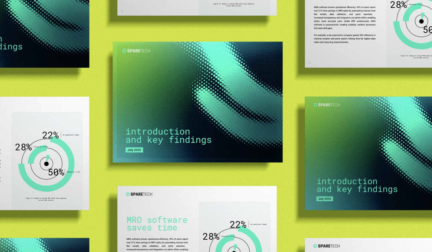
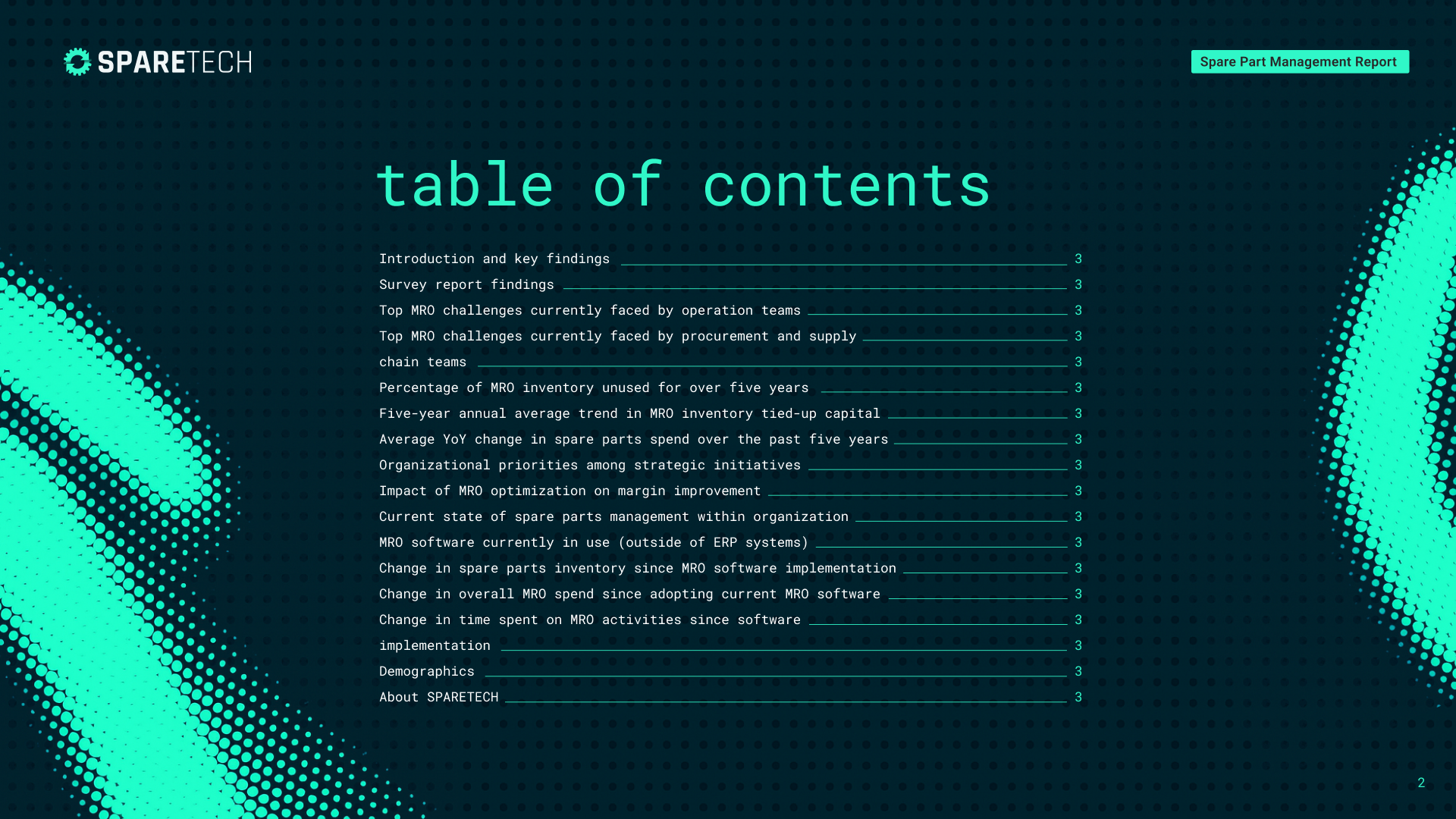
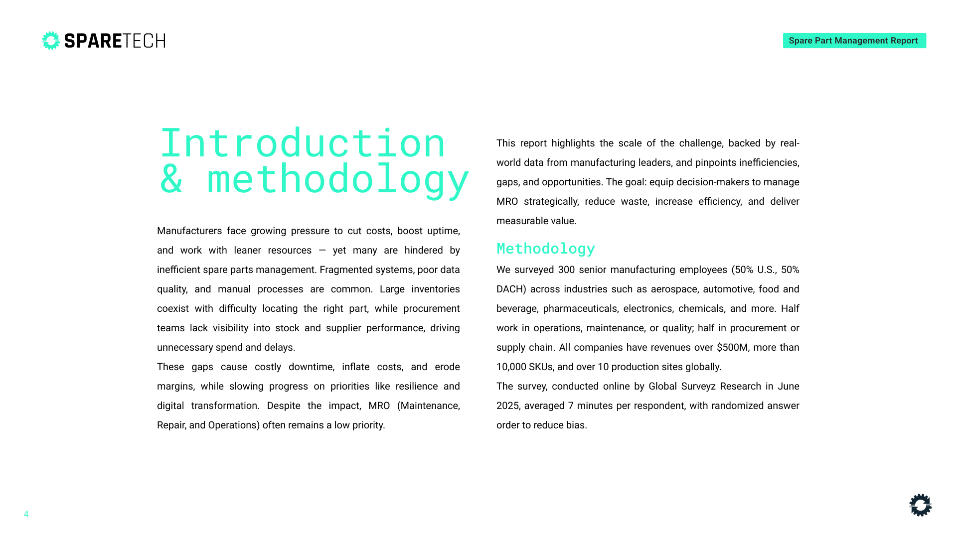
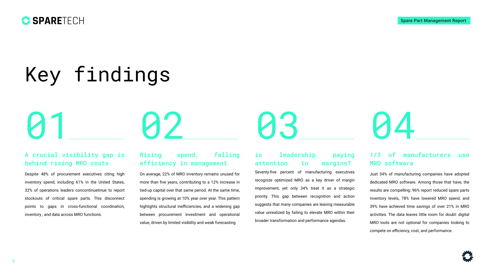
Whitepaper Re-Design
The document structure was fully re-architected to create an intuitive, executive-ready narrative.
Information hierarchy: Clear tiered headings, strategic spacing, and navigational cues guide readers through complex ideas with ease.
Narrative flow: Content was reorganised to progressively build understanding, supporting decision-making rather than overwhelming it.
Executive readability: Layouts were designed for scanning as well as deep reading, ensuring key insights surface quickly.
The result is a white paper that distils complexity into clarity—designed to be read, remembered, and acted upon.
Brand Elevation
While not a full rebrand, the project introduced a refined and unified visual system that elevated Sparetech’s brand presence.
Harmonised typography, colour palette, and spatial rhythm
Introduced greater restraint and consistency to project authority
Created a more confident, sophisticated aesthetic aligned with enterprise audiences
The refined visual language serves a strategic purpose: reinforcing credibility and amplifying the paper’s persuasive power in high-stakes sales and marketing contexts.
Extending the Asset
The white paper became the source from which additional value was extracted.
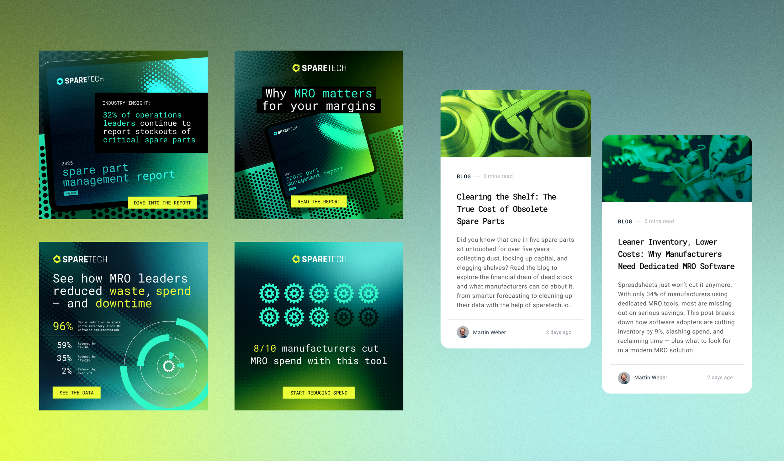
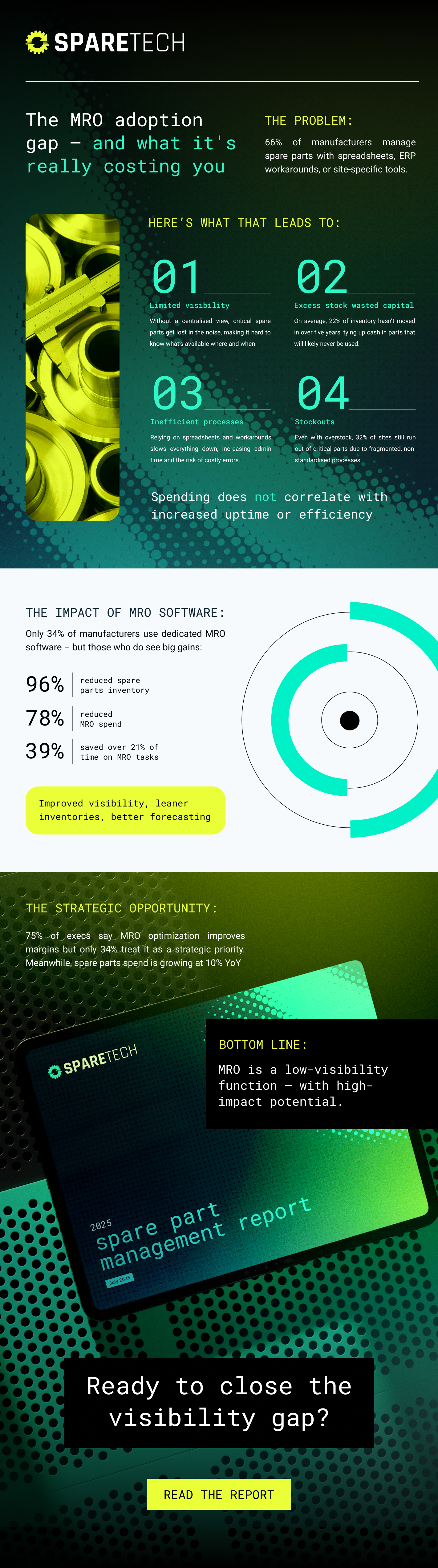
Supplementary infographic: Designed to distil core insights into a highly shareable, standalone asset.
Marketing campaign assets: Key messages and statistics were transformed into modular visuals for thought leadership, social distribution, and blog promotion.
This approach ensures every content investment fuels multiple channels, audiences, and touchpoints—maximising ROI while maintaining visual consistency.