Committee App
FinTech Start-Up
Committee is an early-stage fintech app inspired by ROSCAs, community-based savings models used globally. The app makes it easy for users to pool money in trusted circles and take turns accessing a shared pot. But the founders faced a classic product design conundrum: how do you make an abstract financial tradition intuitive, visual, and actually joyful to interact with?
At the same time, they needed to define their brand and create investor-ready materials, all without losing the human story behind the product.
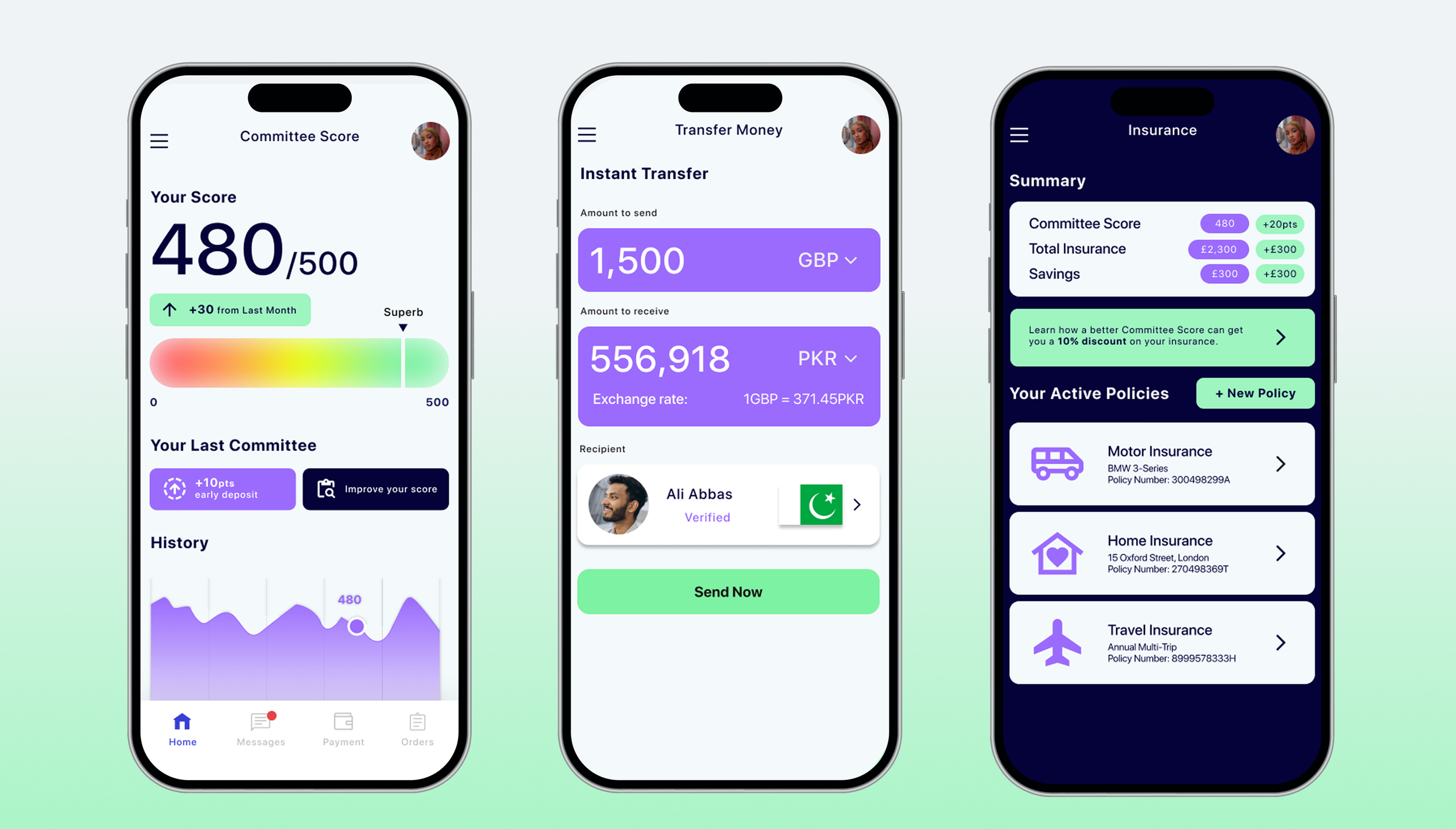
I came on board as Lead Designer at the earliest stages, helping the team shape both the visual identity and the product’s UX. From low-fidelity wireframes to investor decks, I’ve worked closely with the founders to create a product that feels personal, trustworthy, and culturally attuned to the people it’s made for.
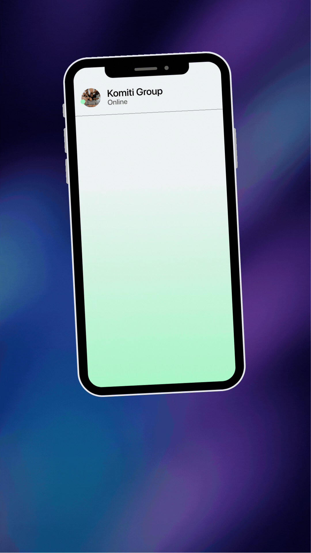
One of the biggest UX hurdles was conceptualising the “Committee Lobby” - the shared space where each member takes their turn to contribute.
After rounds of iteration, I designed a circular ring interface where each member’s avatar takes a seat around the pot. When it’s their turn, they drag their avatar into the centre, triggering a pop-up to make their payment. The design borrows from ritual and rhythm, making the act of saving feel like taking your place in a trusted cycle.
This solved multiple problems at once:
Made turn-taking visible and satisfying
Created a strong sense of group presence
Reinforced trust and transparency with intuitive, game-like interaction

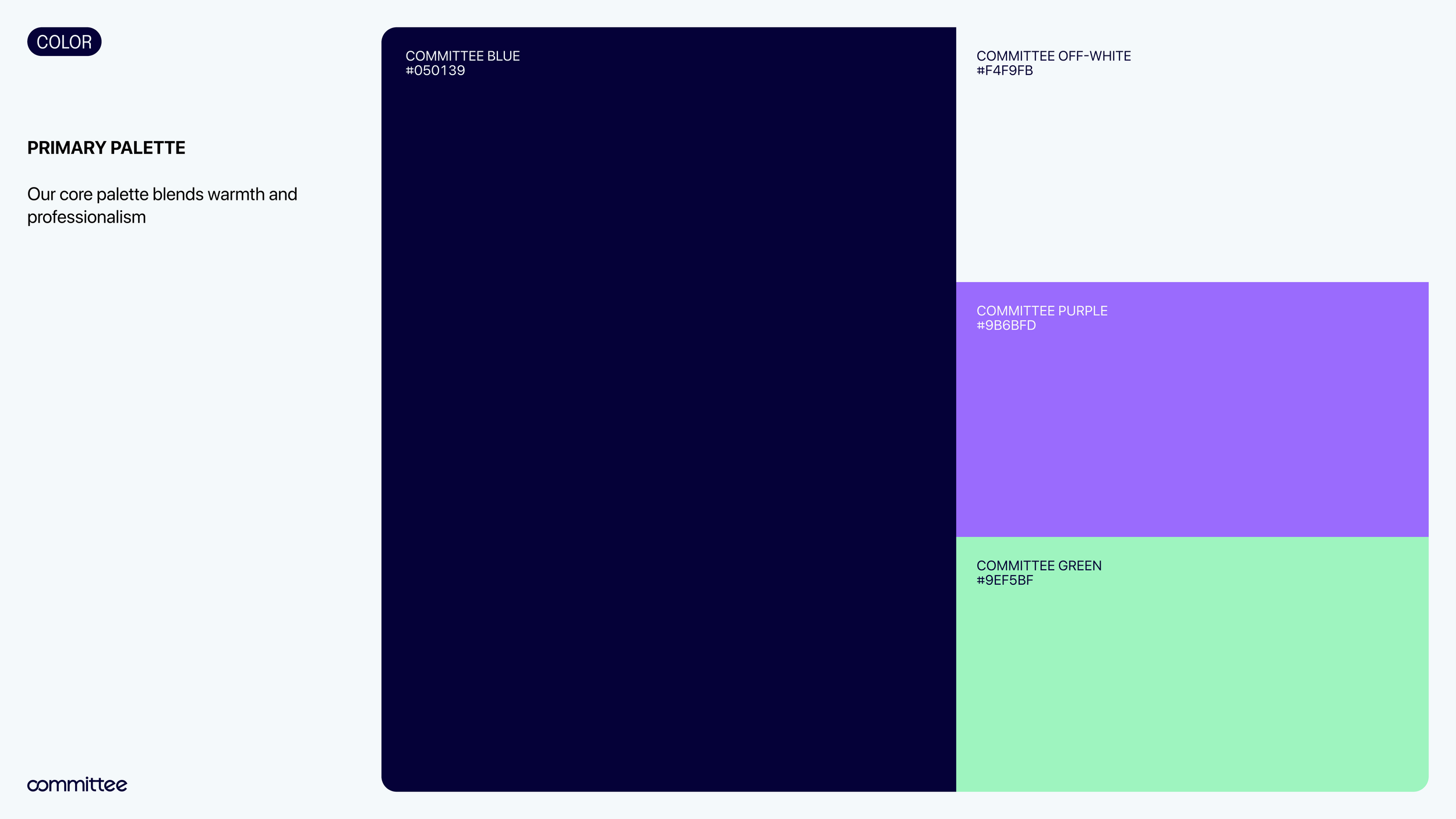
Brand Identity
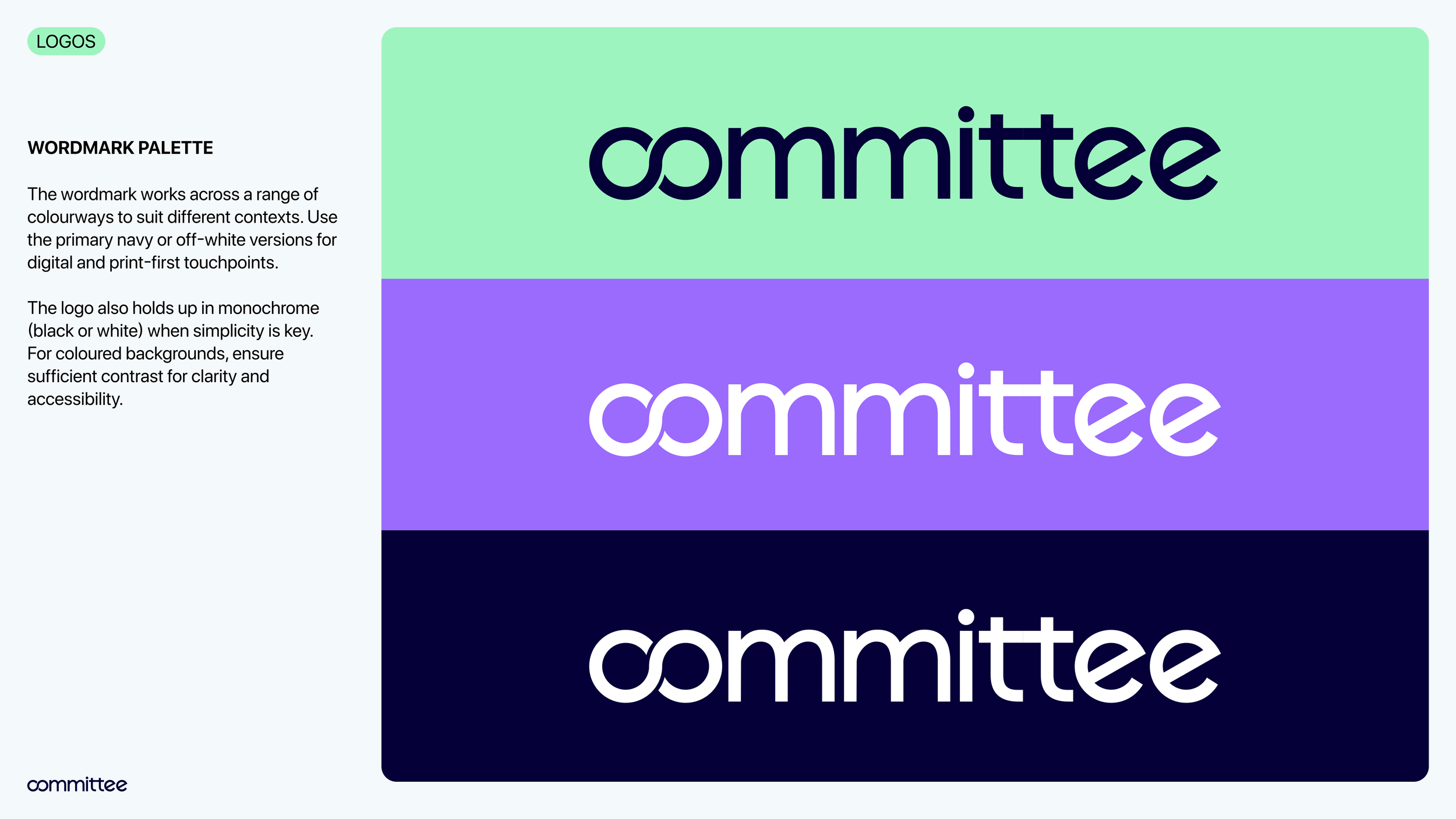
Designed a clean, confident visual identity that balances tech polish with warmth and accessibility. We avoided corporate fintech clichés, instead embracing a softer colour palette, custom icons, and type treatments that suggest community and mutual support.
Investor Pitch Deck
Created a visual-first investor deck that helps the founders tell their story clearly and confidently, weaving together brand, product, and financial vision. The deck was designed to build trust fast, especially with investors unfamiliar with ROSCA traditions.
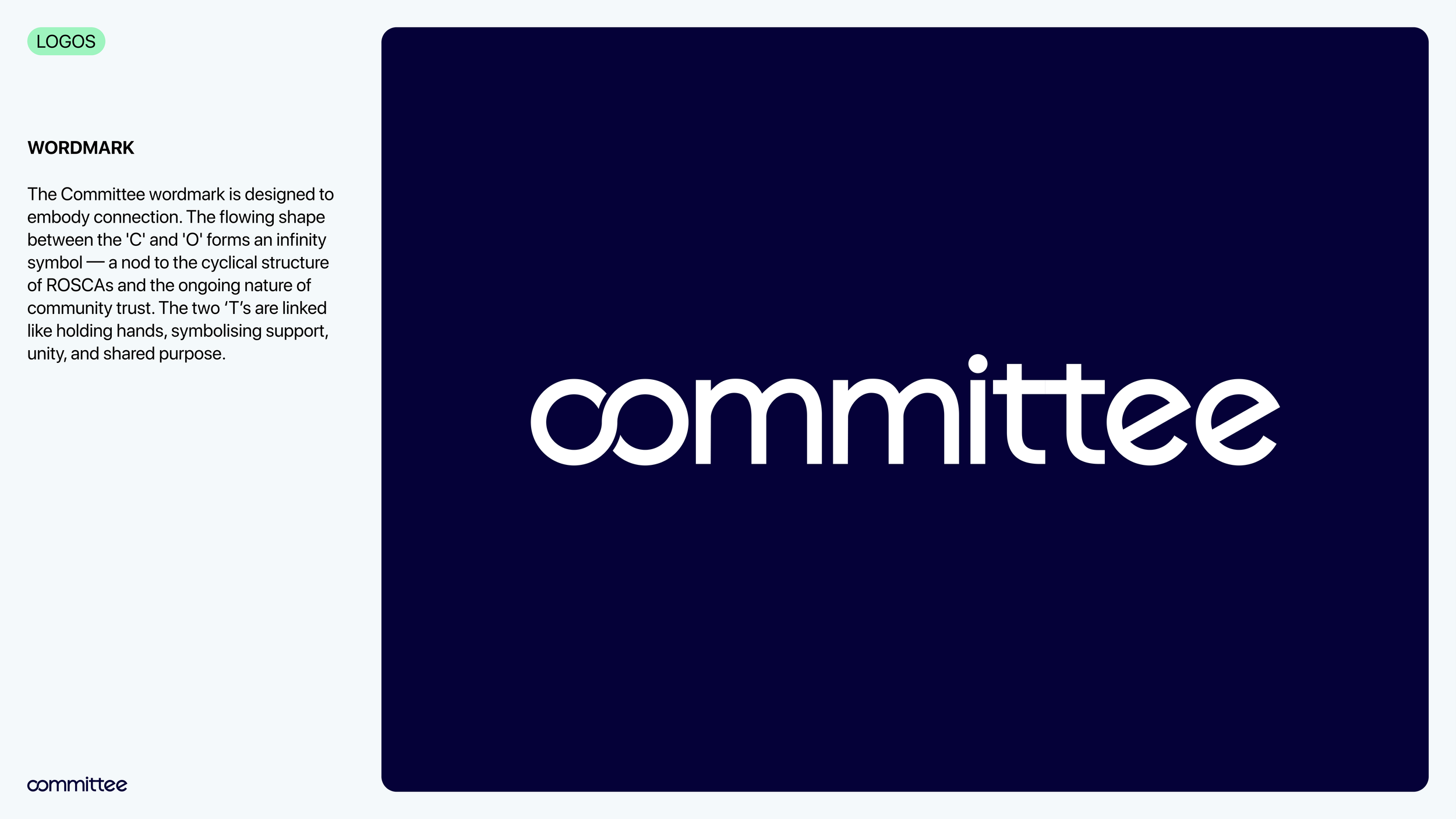
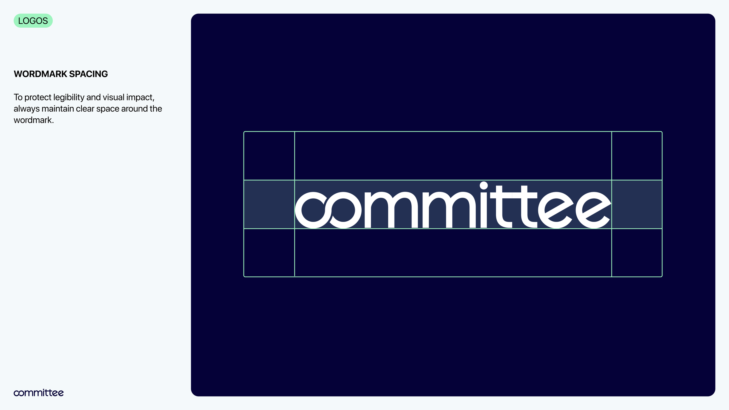
Logo Developmet
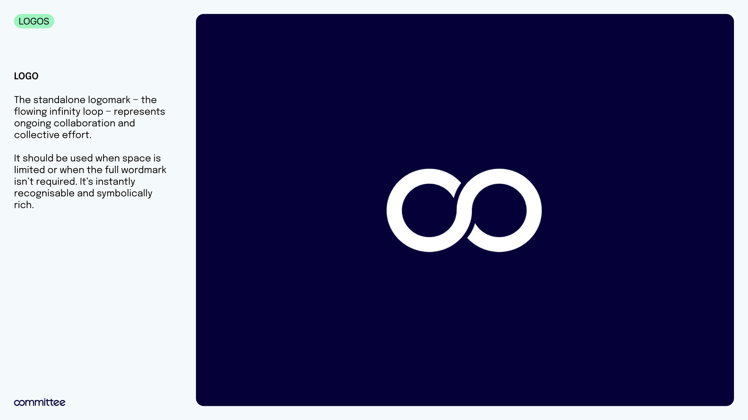
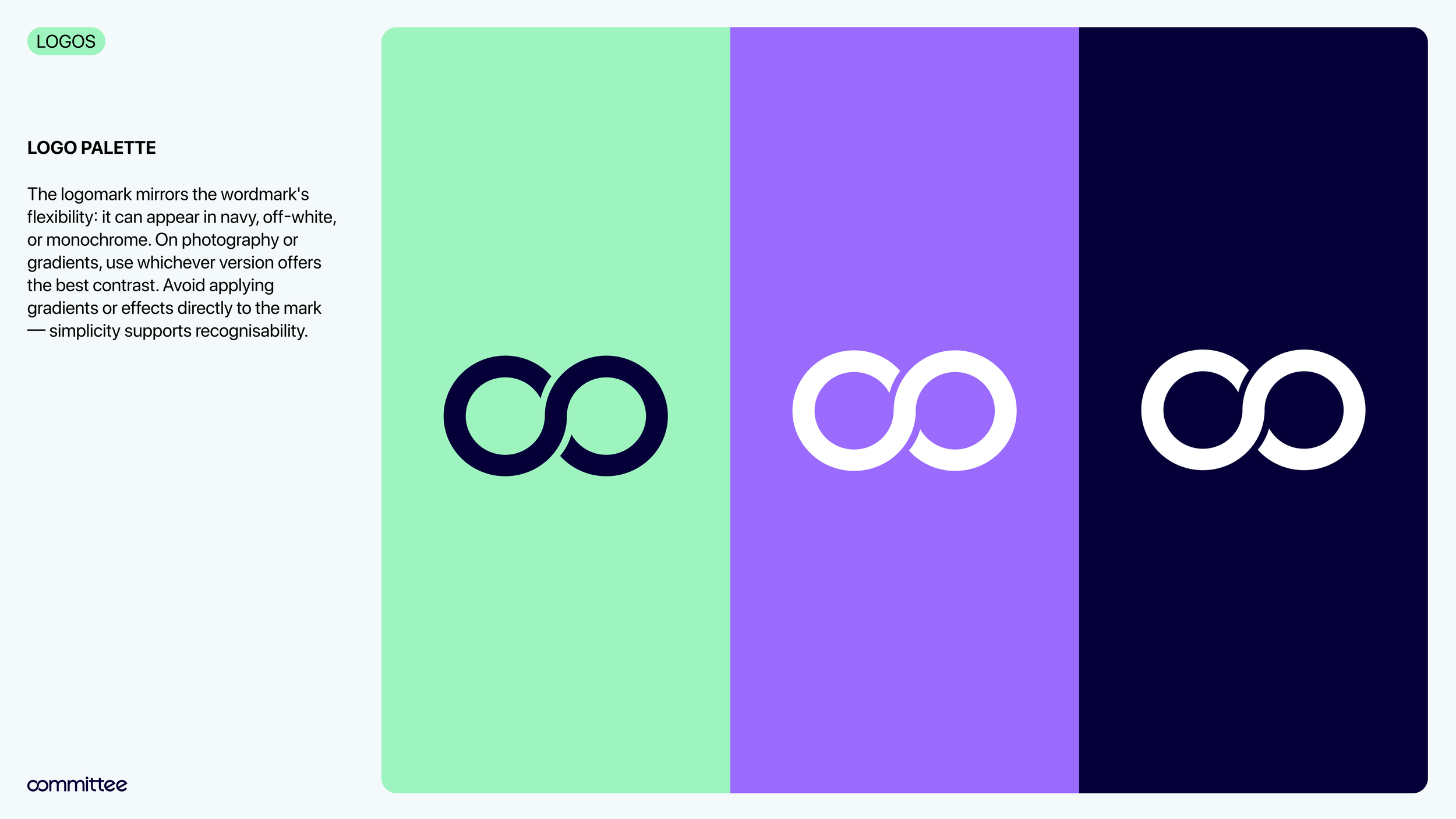
The primary logo was developed as a typographic wordmark that embeds ideas of connection and circulation within the letterforms themselves. The “co” characters interlock to form an infinity symbol, representing the continuous cycle of contributions and payouts at the heart of the ROSCA system and symbolising the collective flow of resources within the group.